I also decided to change a couple of aspects of the costume from my original designs, one being that I decided to use black instead of any colour. I think overall I want the costume to have a creepy side to it, and using colour will make it look too bright and cheery. I think the black/ grey of the prints will also make the design more cohesive, and means with a limited colour palette I can be free to explore different illustrations without having the whole thing look messy. Another aspect of the costume I decided to change was having patches on the inside- I think I'm going to have all different illustrations on the outside and then just line the costume with a plain fabric.
I used my forest paintings for my initial gum arabic prints, they are bold enough to not lose too much detail in the printing process, and the gum arabic could look especially faded on fabric ( it can be quite patchy on paper at the best of times!)

I was really happy with the outcome as the images came out a lot clearer than I expected. The washed out black of the prints creates a kind of moody and creepy atmosphere to the images, and this is the kind of effect I wanted for the final piece. I want the costume to seem intimidating at first, and I think these kind of prints would create that atmosphere due to their mysterious appearance.

A couple of the prints didn't come out perfectly, but this is to be expected when printing many different things. The pieces are still definitely useable, and Andrew pointed out that where I see faults others might see something interesting.

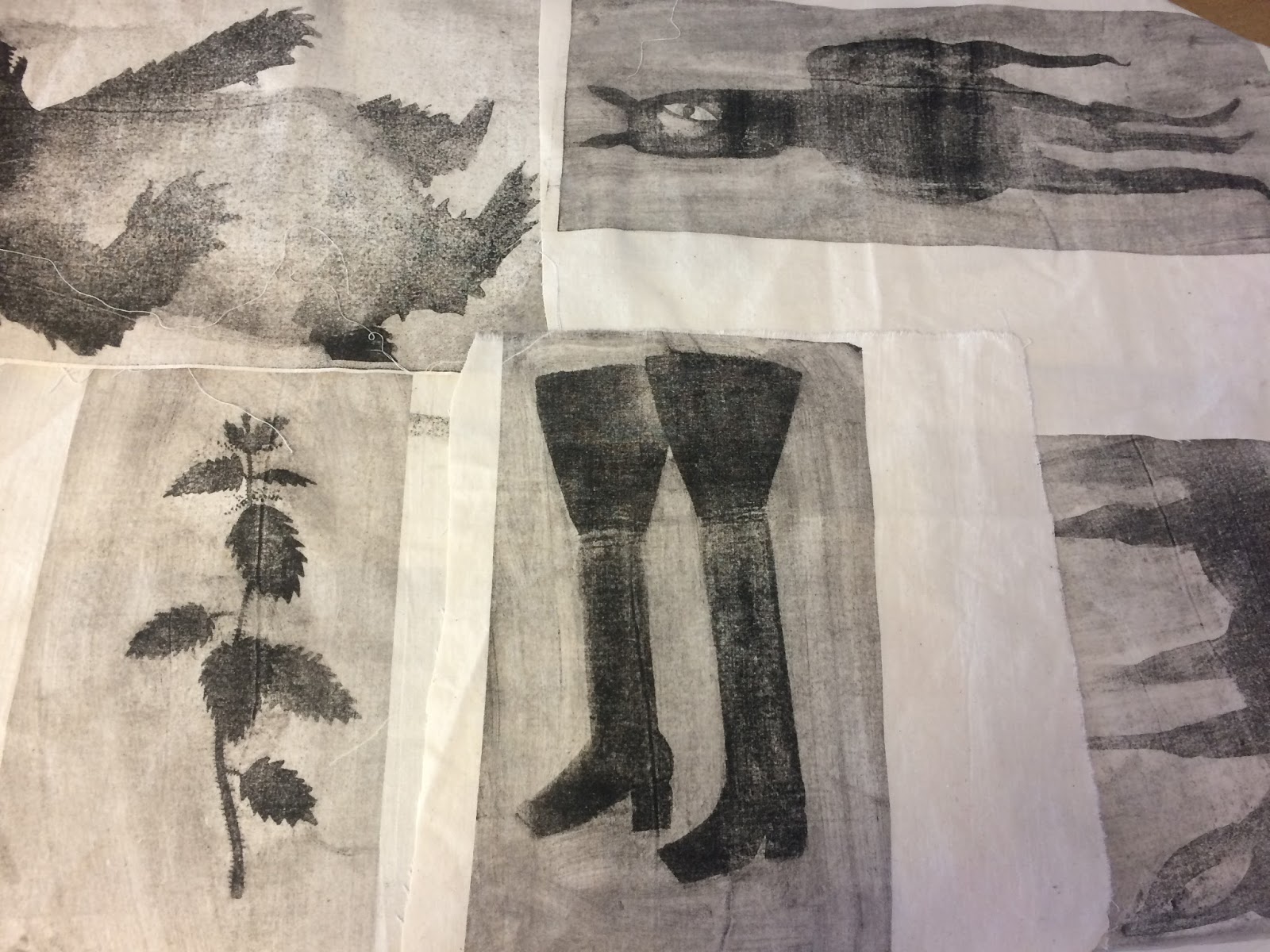
This horse printed quite patchy overall, but the darkness of the tail does create an interesting image- but the feet are particularly faded.


The wild boar also printed quite pale overall, and also printed over a crease which left a mark down it's body- when it comes to sewing together the costume I think I will try and iron it out- but then it also adds something quite macabre and foreboding to the image too!

Although happy with the results after this first batch of gum arabic I was still slightly wary of going forward, although a few of them had turned out well just as many weren't as bold as I wanted them to be. I started printing some lino prints on fabric to see if they would work, and I was happy with those results, and I think relief print is something that is less 'spontaneous' than gum arabic. However, I really wanted the gum arabic to work as I think the juxtaposition of the washy grey prints next to the bold lino prints will look good on the costume.
I started preparing more images to print on gum arabic, making sure they had as much solid black in them as possible so that the ink would stick to it and create a crisper image, but also experimented by adding more texture and pattern. Those illustrations can be seen here.
I decided to make loads of drawings to use with gum arabic as I thought it was still a fairly unreliable process (which actually fits in quite well with my overall theme! Unreliable story told with an unreliable form of printing... ) so my reasoning was that if I print lots then at least some of them have to work out OK.
As it turns out the printing gods must have been smiling down on me, because from that moment on almost all of the gum arabic prints turned out crisp and with a rich black, and even the ones that are paler are definitely still useable.


Below I double printed the small bat to see if there was enough ink left to make double prints- it was paler than I would like but it's still a good size patch to use in case I have to fill any gaps!


To experiment with the prints I also started cutting some images out in order to create a crisp line, for example with the profile face above. I think this contrast between the grey/black print and the bright fabric is very dynamic, and again will stand out when sewn together with all the other printed patches.
At one point I started using a thicker fabric than the other patches, a linen that Mark had kindly donated to my cause. I had been using this linen for my lino prints, but I had some left to use for some gum arabic. I noticed that although I hadn't changed my technique that the prints were looking paler, and I realised that this was probably because of the thicker fabric not having the same amount of pressure as the thinner curtain lining. By adding some newsprint on top this heightened the pressure and the result was a stronger print- which can be seen below comparing one print without the extra newsprint and one with it:

Just by adding some extra packing to the press, the rabbit on the left printed with a richer black than the illustration beside it. I think by printing so many different illustrations by the end I could detect where I was going wrong and then attempt to correct it, which for me was a great feeling of accomplishment.

With the paler prints from before, I decided to layer them using screen print, as well as using small patches of red screen print on specific story telling patches, so that the audience can piece the story together with these clues. Below are a couple of these story patches that I have scanned in, as well as some of my other favourite patches (and the boots are an example of gum arabic with screen print on top):


No comments:
Post a Comment