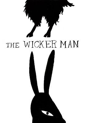
With this workshop we were encouraged to look at unusual compositions, as it is important that illustrations don't end up looking too flat or boring with the same old compositions that are used time and time again. I definitely think I am guilty of using the same composition for my work, so I thought it was important to try this workshop as it could bring new ideas to my illustrations as well as help me improve the illustrated aspects of my FMP.
As we had to design modern film posters for a particular film, I chose The Wicker Man. I thought this would be cohesive with my project as it's themes include folk lore, the occult and weird costumes. I started by exploring different compositions in thumbnails, focusing on not just putting things in the middle of the page.
 |
| [a] |
I liked having images cut off either at the top or the bottom of the poster as I think this emphasised the mysterious nature of the film, and I think including the 'hand of glory' candle from the film (see above) is either a recognisable element to people that have seen the film, or is a gory and intriguing image for people who haven't.

I also decided to use hand drawn type for the posters, again to highlight the idea of hand made/ folky/ ancient people on a tiny island. I experimented with both using line and block colour in the posters, and I think overall my favourite is the bottom poster out the of three because it is the most simple and eye-catching. To build upon this, I added a wicker man on the middle finger, and then also experimenting with putting little figures on the other flames.
However, I think the little costumes on each finger looked unclear and messy, so I edited it down to just the wicker man, and again I preferred the cleaner and simpler option as it seems more subtle and mysterious like the film itself.
I then experimented with a different image of someone dressed in an animal costume, this time using a bubblegum pink to portray the film in a different light- almost Wes Anderson-esque. Again I think if you know the film, this makes the poster kind of creepy as you know that the animal is not just a friendly fox in a shirt, but someone in a costume who is up to no good. I prefer the right hand illustration as it is more detailed and seems more sinister than the one on the left, which is far more simplified.

Above, I explored splitting the image and placing them at the top and bottom of the poster, using imagery of animals to relay the idea of a rural place combined with costume- creating a world where the two blur together. I also mismatched the animals to emphasise this confusions and weirdness, and experimented with positioning the text to see where it was most dynamic.
Using the same animal illustrations that I had painted I used them to create a composition where it was very concentrated at the top and then faded out towards the bottom of the page. I added red gradients to communicate danger and intensity, but I don't think the fade worked with my style. I did try to experiment more with placing the text in the snake instead of at the top of the poster, but in general apart from the composition this wasn't one of my favourite designs.

The image below I rasterised in Illustrator and then just added the title to make a basic poster and image, not really focusing on an interesting composition but drawing attention to the image of a goat head which has occultist and mysterious connotations.
To echo the traditional and retro style of the movie (watching it now of course) I thought about creating a screen print, block style poster. I did this by overlapping the animals I had painted in Photoshop and giving them each muted colours.
IMAGE REFERENCE
[a] EBERT, ROGER- 2013
Ebert, R. 2013. The Wicker Man: The cut may be final, bu the film is still incomplete. [Online]. Available from: http://www.rogerebert.com/balder-and-dash/the-wicker-man-the-cut-may-be-final-but-the-film-is-still-incomplete


No comments:
Post a Comment